Title: Heatmap plot with a cut-off on both top and bottom · Issue #14751 · matplotlib/matplotlib · GitHub
Open Graph Title: Heatmap plot with a cut-off on both top and bottom · Issue #14751 · matplotlib/matplotlib
X Title: Heatmap plot with a cut-off on both top and bottom · Issue #14751 · matplotlib/matplotlib
Description: Bug report Bug summary I follow the matplotlib tutorial from Creating annotated heatmaps and just copy and run the first case. Then I get a weird plot with a cut-off on both top and bottom. It also happens when I use Seaborn to plot an i...
Open Graph Description: Bug report Bug summary I follow the matplotlib tutorial from Creating annotated heatmaps and just copy and run the first case. Then I get a weird plot with a cut-off on both top and bottom. It also...
X Description: Bug report Bug summary I follow the matplotlib tutorial from Creating annotated heatmaps and just copy and run the first case. Then I get a weird plot with a cut-off on both top and bottom. It also...
Opengraph URL: https://github.com/matplotlib/matplotlib/issues/14751
X: @github
Domain: github.com
{"@context":"https://schema.org","@type":"DiscussionForumPosting","headline":"Heatmap plot with a cut-off on both top and bottom","articleBody":"\u003c!--To help us understand and resolve your issue, please fill out the form to the best of your ability.--\u003e\r\n\u003c!--You can feel free to delete the sections that do not apply.--\u003e\r\n\r\n### Bug report\r\n\r\n**Bug summary**\r\nI follow the matplotlib tutorial from [_Creating annotated heatmaps_ ](https://matplotlib.org/3.1.0/gallery/images_contours_and_fields/image_annotated_heatmap.html)and just copy and run the first case. \r\n\r\nThen I get a weird plot with a cut-off on both top and bottom. \r\n\r\nIt also happens when I use [Seaborn ](https://github.com/mwaskom/seaborn)to plot an image. \r\n\u003c!--A short 1-2 sentences that succinctly describes the bug--\u003e\r\n\r\n**Code for reproduction**\r\n\r\n\u003c!--A minimum code snippet required to reproduce the bug.\r\nPlease make sure to minimize the number of dependencies required, and provide\r\nany necessary plotted data.\r\nAvoid using threads, as Matplotlib is (explicitly) not thread-safe.--\u003e\r\n\r\n```python\r\nimport numpy as np\r\nimport matplotlib\r\nimport matplotlib.pyplot as plt\r\n# sphinx_gallery_thumbnail_number = 2\r\n\r\nvegetables = [\"cucumber\", \"tomato\", \"lettuce\", \"asparagus\",\r\n \"potato\", \"wheat\", \"barley\"]\r\nfarmers = [\"Farmer Joe\", \"Upland Bros.\", \"Smith Gardening\",\r\n \"Agrifun\", \"Organiculture\", \"BioGoods Ltd.\", \"Cornylee Corp.\"]\r\n\r\nharvest = np.array([[0.8, 2.4, 2.5, 3.9, 0.0, 4.0, 0.0],\r\n [2.4, 0.0, 4.0, 1.0, 2.7, 0.0, 0.0],\r\n [1.1, 2.4, 0.8, 4.3, 1.9, 4.4, 0.0],\r\n [0.6, 0.0, 0.3, 0.0, 3.1, 0.0, 0.0],\r\n [0.7, 1.7, 0.6, 2.6, 2.2, 6.2, 0.0],\r\n [1.3, 1.2, 0.0, 0.0, 0.0, 3.2, 5.1],\r\n [0.1, 2.0, 0.0, 1.4, 0.0, 1.9, 6.3]])\r\n\r\n\r\nfig, ax = plt.subplots()\r\nim = ax.imshow(harvest)\r\n\r\n# We want to show all ticks...\r\nax.set_xticks(np.arange(len(farmers)))\r\nax.set_yticks(np.arange(len(vegetables)))\r\n# ... and label them with the respective list entries\r\nax.set_xticklabels(farmers)\r\nax.set_yticklabels(vegetables)\r\n\r\n# Rotate the tick labels and set their alignment.\r\nplt.setp(ax.get_xticklabels(), rotation=45, ha=\"right\",\r\n rotation_mode=\"anchor\")\r\n\r\n# Loop over data dimensions and create text annotations.\r\nfor i in range(len(vegetables)):\r\n for j in range(len(farmers)):\r\n text = ax.text(j, i, harvest[i, j],\r\n ha=\"center\", va=\"center\", color=\"w\")\r\n\r\nax.set_title(\"Harvest of local farmers (in tons/year)\")\r\nfig.tight_layout()\r\nplt.show()\r\n```\r\n**Actual outcome**\r\n\r\n\u003c!--The output produced by the above code, which may be a screenshot, console output, etc.--\u003e\r\n\r\n\r\n\r\n\r\n**Expected outcome**\r\n\r\n\u003c!--A description of the expected outcome from the code snippet--\u003e\r\n\u003c!--If this used to work in an earlier version of Matplotlib, please note the version it used to work on--\u003e\r\n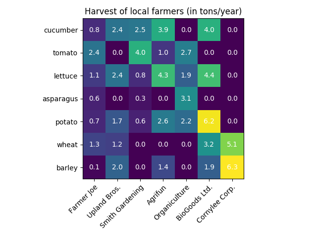\r\n\r\n**Matplotlib version**\r\n\u003c!--Please specify your platform and versions of the relevant libraries you are using:--\u003e\r\n * Operating system: Windows 10 1903\r\n * Matplotlib version: 3.1.0\r\n * Matplotlib backend (`print(matplotlib.get_backend())`): TkAgg\r\n * Python version: 3.7.3\r\n\r\n\r\n\u003c!--Please tell us how you installed matplotlib and python e.g., from source, pip, conda--\u003e\r\n\u003c!--If you installed from conda, please specify which channel you used if not the default--\u003e\r\n\r\n","author":{"url":"https://github.com/Wangqkoe","@type":"Person","name":"Wangqkoe"},"datePublished":"2019-07-12T20:06:11.000Z","interactionStatistic":{"@type":"InteractionCounter","interactionType":"https://schema.org/CommentAction","userInteractionCount":3},"url":"https://github.com/14751/matplotlib/issues/14751"}| route-pattern | /_view_fragments/issues/show/:user_id/:repository/:id/issue_layout(.:format) |
| route-controller | voltron_issues_fragments |
| route-action | issue_layout |
| fetch-nonce | v2:f6eaca19-d0c5-3d91-ff9c-70453bf13d6d |
| current-catalog-service-hash | 81bb79d38c15960b92d99bca9288a9108c7a47b18f2423d0f6438c5b7bcd2114 |
| request-id | C7AC:338054:15DC9DF:1FD4462:6A54DEB7 |
| html-safe-nonce | 13db939080dc178a9b3bc8a48fe62267cc12706de5003cbdf821548a91079dac |
| visitor-payload | eyJyZWZlcnJlciI6IiIsInJlcXVlc3RfaWQiOiJDN0FDOjMzODA1NDoxNURDOURGOjFGRDQ0NjI6NkE1NERFQjciLCJ2aXNpdG9yX2lkIjoiNDY5OTM1NTE1NDY1MDI5MTg5NSIsInJlZ2lvbl9lZGdlIjoiaWFkIiwicmVnaW9uX3JlbmRlciI6ImlhZCJ9 |
| visitor-hmac | ba50be65721e0434a886d44124f86318e82907f50b381dea364b347c0ded4a73 |
| hovercard-subject-tag | issue:467580346 |
| github-keyboard-shortcuts | repository,issues,copilot |
| google-site-verification | Apib7-x98H0j5cPqHWwSMm6dNU4GmODRoqxLiDzdx9I |
| octolytics-url | https://collector.github.com/github/collect |
| analytics-location | / |
| fb:app_id | 1401488693436528 |
| apple-itunes-app | app-id=1477376905, app-argument=https://github.com/_view_fragments/issues/show/matplotlib/matplotlib/14751/issue_layout |
| twitter:image | https://opengraph.githubassets.com/816b583214201f46a0c9ffd126f7875d3d8312e6721195949d3970780dbdb998/matplotlib/matplotlib/issues/14751 |
| twitter:card | summary_large_image |
| og:image | https://opengraph.githubassets.com/816b583214201f46a0c9ffd126f7875d3d8312e6721195949d3970780dbdb998/matplotlib/matplotlib/issues/14751 |
| og:image:alt | Bug report Bug summary I follow the matplotlib tutorial from Creating annotated heatmaps and just copy and run the first case. Then I get a weird plot with a cut-off on both top and bottom. It also... |
| og:image:width | 1200 |
| og:image:height | 600 |
| og:site_name | GitHub |
| og:type | object |
| og:author:username | Wangqkoe |
| hostname | github.com |
| expected-hostname | github.com |
| None | a556215b071af6609619e2bbe6f00bdfbf0812ad723b1ae6c301858a7a829f54 |
| turbo-cache-control | no-preview |
| go-import | github.com/matplotlib/matplotlib git https://github.com/matplotlib/matplotlib.git |
| octolytics-dimension-user_id | 215947 |
| octolytics-dimension-user_login | matplotlib |
| octolytics-dimension-repository_id | 1385122 |
| octolytics-dimension-repository_nwo | matplotlib/matplotlib |
| octolytics-dimension-repository_public | true |
| octolytics-dimension-repository_is_fork | false |
| octolytics-dimension-repository_network_root_id | 1385122 |
| octolytics-dimension-repository_network_root_nwo | matplotlib/matplotlib |
| turbo-body-classes | logged-out env-production page-responsive |
| disable-turbo | false |
| browser-stats-url | https://api.github.com/_private/browser/stats |
| browser-errors-url | https://api.github.com/_private/browser/errors |
| release | 00f21e38abd06cd6752db5c227083570f72fdb6c |
| ui-target | canary-1 |
| theme-color | #1e2327 |
| color-scheme | light dark |
Links:
Viewport: width=device-width